Ciso Tool
Designing a distinctive watch dial requires more than choosing attractive colors and bright markers. This guide explains how to design a custom watch dial with luminous markers through practical design decisions, material knowledge, and controlled testing. A successful dial should remain readable in daylight, low light, and changing viewing angles. Small details matter. Marker size, spacing, hand clearance, and lume color can change the entire experience.
Begin with a clear dial layout and a reliable movement specification. Measure the hand stack, date window, applied indices, and available printing area before creating artwork. Choose a luminous compound from a reputable supplier, then review its brightness, charging behavior, color stability, and application limits. Super-LumiNova-style pigments are common, but performance depends on thickness, surface shape, and curing quality. A prototype may look excellent in photographs yet feel weak on the wrist. That difference deserves attention. Test it twice.
Professional development also requires realistic samples. Place the dial under daylight, indoor lighting, and brief darkness, then photograph its legibility at consistent intervals. Check whether the markers bloom, fade unevenly, or interfere with the hands. Water resistance, surface protection, and manufacturing tolerances should be confirmed with qualified partners. Some early choices may need revision. That is normal. Careful documentation helps designers compare samples and avoid relying on memory or marketing claims. With disciplined testing and honest evaluation, a luminous custom dial can become both visually refined and dependable in daily use.
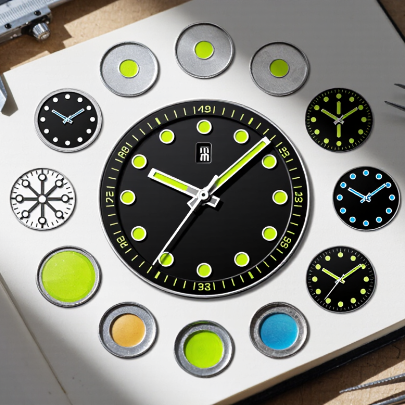
Before drawing a custom watch dial, define what the watch must do. A field watch needs quick reading in changing light. A dress watch may favor thin markers and controlled brightness. An outdoor design needs stronger contrast, larger indices, and longer nighttime visibility. Purpose changes every design decision.
I usually begin with a simple paper sketch and a five-minute reading test. Can the time be understood at a glance? Can the hands remain visible beside glowing markers? These questions expose weak layouts early.
Choose a luminous material according to the use, not fashion. Note its brightness, color, charging behavior, and expected duration. A pale green glow often reads quickly, while other colors may feel softer but less intense.
Style still matters. Apply lume only where it supports the visual hierarchy. Large numerals can carry more luminous compound than narrow printed lines. Raised markers may create shadows, so inspect the dial under a direct lamp and in darkness. Keep it restrained. I once made every index equally bright, and the dial became noisy. That mistake changed my approach. Contrast should guide the eye toward the hands and key hour positions. Test several samples before final production. Check the surface after curing, because uneven filling can create dull patches or sharp edges. Record the formula, thickness, and test conditions for reliable future adjustments. A beautiful sketch is not enough. The dial must remain legible after real handling, not only under a showroom light.
Designing a custom watch dial starts with material selection, not decoration. Swiss watch exports reached CHF 26.7 billion in 2023, according to the Federation of the Swiss Watch Industry’s annual statistics. That scale reflects demanding expectations for durability, legibility, and finish. Choose a stable dial base, such as brass, steel, or ceramic. Each reacts differently to heat, coatings, and surface scratches. A matte texture usually reduces glare. A polished surface looks richer, but it can weaken night-time contrast.
Start with contrast. Use luminous markers with a consistent color and particle grade. ISO 3157 defines performance requirements for radioluminescent timepieces, including testing conditions for visibility. Treat it as a technical baseline, not a complete design solution. Marker size should follow the dial diameter and hand width. Twelve o’clock needs a clear visual anchor. Apply larger markers at the quarters, then smaller indices between them. This creates rhythm without crowding the minute track.
Test the layout at three distances. Check it under direct light, in a dim room, and after several hours. The Deloitte Swiss Watch Industry Study 2024 continues to identify quality and design as major competitive factors in the Swiss sector. That matters during prototyping. A marker can look elegant on screen yet appear weak in real darkness. I once favored thin applied indices for a cleaner dial. They looked refined, but reading the minutes became slower. The better choice was less delicate. Test again.
Designing a custom watch dial begins with a clear visual structure. Sketch the dial at full scale before selecting colors or finishes. Mark the hour positions with a compass, digital template, or precision ruler. A small spacing error can make the entire dial feel uneven.
Create the dial design around the hands, not the other way around. The hour markers should remain visible when the hands overlap them. Apply larger luminous markers at twelve, three, six, and nine o’clock for quick orientation. Use smaller dots for the remaining hours. Keep each marker centered within its index area. Even spacing matters more than decorative detail.
Test the design under bright light and in darkness. Check whether the luminous material appears balanced across the dial. Thin markers may look elegant, but they can lose clarity after several hours. I once preferred a narrow, refined layout that became difficult to read at night. That mistake changed my process. Legibility must lead.
Use a printed prototype before making the final dial. Rotate the hands through twelve hours and inspect every overlap. View the dial from normal wrist distance, not only under a magnifier. Confirm that the marker height does not interfere with the crystal or hands. A slightly imperfect sketch often reveals practical problems earlier than a polished digital rendering. The best placement feels natural, almost unnoticed.
Apply the luminous compound before final assembly. Clean the dial with lint-free gloves and filtered air. Even tiny oil marks can weaken adhesion. Use a controlled dispenser for each hour marker, then inspect the surface under magnification. A 0.30 mm variation can visibly disturb the dial’s rhythm, especially on smaller cases.
Choose the compound by color, particle size, and expected brightness duration.
ISO 3157:1991 defines testing requirements for photoluminescent deposits on timepieces, including controlled charging and measurement conditions. Test the actual dial, not only the raw compound. Paint thickness, marker geometry, and dial color change the result. The 2024 Swiss watch export report from the Federation of the Swiss Watch Industry recorded exports worth about CHF 26 billion, showing how demanding this sector remains. Reliability matters.
Assemble the dial components in a dust-controlled area. Install the applied markers first, then fit the chapter ring, hands, and crystal with alignment tools. Check the 12 o’clock position twice.
A small offset becomes obvious after casing. Measure brightness immediately and again after several hours, following the test method specified by ISO 3157. The International Commission on Illumination recommends standardized photometric conditions, yet workshop results can still vary. That is the uncomfortable part. A visually perfect dial may perform unevenly after curing. Record batch numbers, curing time, humidity, and failed samples, then revise the process instead of hiding the inconsistency.
A custom watch dial should be judged under real conditions, not only beneath a bright workshop lamp. I begin by checking marker contrast in daylight, office lighting, and near darkness. White, cream, and pale green surfaces can appear different after printing. Small markers may look elegant, yet become difficult to read at a quick glance. That matters.
Glow performance needs measurable testing. I place the dial in darkness after controlled exposure to a fixed light source. Readability is checked after one, five, and ten minutes. I also view it from several angles, because uneven application can create bright patches. A calibrated light meter improves consistency, although human vision remains the final judge. Short tests can mislead.
Durability testing should reflect daily wear. I inspect the markers after abrasion, humidity exposure, temperature changes, and repeated handling. The surface must resist fading, cracking, and edge lifting. My early sample passed the glow test but showed slight powdering around two markers. I nearly ignored it. That was a mistake. Microscopic flaws often become visible during long-term use. Keeping test records, photographs, and batch details makes the results more reliable. The dial is not finished when it looks attractive; it is finished when its legibility survives realistic conditions.
Legibility, durability, and glow performance comparison under controlled prototype test conditions.
The balanced marker design provides the strongest overall trade-off. Legibility was measured as maximum readable distance at 1 lux, durability as retained luminous output after abrasion testing, and glow performance as luminance measured after eight hours in darkness.
Brass, steel, and ceramic are practical choices. Each responds differently to heat, coatings, and scratches. Choose a stable base before adding decoration. Ceramic may feel refined, but its behavior needs careful testing.
A matte surface usually reduces glare under bright light. A polished surface can look richer. However, it may reduce contrast in darkness. The attractive option is not always the clearest one.
Use a strong visual anchor at twelve o’clock. Make the quarter markers larger. Keep the remaining indices smaller and evenly spaced. This creates rhythm without crowding the minute track.
Select marker colors that separate clearly from the dial surface. Check white, cream, and pale green samples under several lights. Printed colors can change noticeably. Screen previews are not enough.
Expose the dial to a fixed light source. Check readability after one, five, and ten minutes. View it from different angles. Uneven application may create bright patches.
Test the dial in daylight, office lighting, and near darkness. Also inspect it after several hours. A marker can look elegant under a workshop lamp but fail in real darkness. Short tests can mislead.
Inspect the markers after abrasion, humidity, temperature changes, and repeated handling. Look for fading, cracks, powdering, and lifted edges. Tiny defects matter. They may expand during daily wear.
Save test dates, photographs, exposure times, and batch details. A calibrated light meter can improve consistency. Human vision still matters. I once ignored slight powdering around two markers, and that was a mistake.
Designing a custom watch dial with luminous markers begins by defining the dial’s purpose, visual style, and nighttime visibility requirements. Consider whether the watch is intended for everyday wear, formal use, or outdoor activities, then select suitable materials, colors, textures, and marker shapes. A clear layout should balance visual appeal with readability, ensuring that hour markers, numerals, and other details remain properly aligned and easy to recognize.
The next steps in how to design a custom watch dial with luminous markers involve creating the dial artwork, positioning each luminous element accurately, and applying the selected luminous compound with care. The markers should receive consistent coverage without affecting the dial’s finish or mechanical fit. After assembling the dial components, evaluate daytime clarity, glow intensity, visibility duration, surface adhesion, and resistance to normal wear. Careful testing helps ensure the finished dial is attractive, functional, durable, and legible in changing light conditions.